DH110
User Experience & Design
This project is maintained by emilydong001
Mayo Clinic Website Redesign - Accessible Delivery of Healthcare Information to Seniors
By Emily Dong
Introduction
Seniors need easier access to health information
According to the United Nations, the number of seniors (65+) is expected to double to 1.5 billion by 2050 globally. Despite seniors being one of the fastest-growing and most affluent demographic groups in wealthy countries, many digital products fail to meet senior accessibility needs and have excluded them from an online world that mostly caters to those with good eyesight, dexterity, and familiarity with the web.
Health, in particular, is one of the major concerns among seniors, and we should ensure that information is accessible to them. For this project, I hope to demonstrate how we can improve user (patient) experiences on websites with health, healthcare, and patient information so that seniors can maintain their well-being. Additionally, by designing for their accessibility, we are designing for everyone’s accessibility.
Design Statement
Preserving value while advocating for senior needs
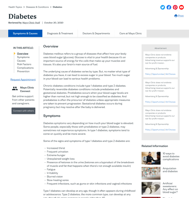
Mayo Clinic is a non-profit American medical organization dedicated to clinical practice, education, and research, and is a trusted source of medical information about diseases and conditions across the world. The website is also used by patients to make appointments, access their patient account, and find information about receiving care. From my own observations, the richness of health information and breadth of features on the Mayo Clinic website can be both extremely valuable and overwhelming. My goal is to preserve the value of Mayo Clinic’s health information while streamlining people’s ability to navigate throughout the website. Not only would this better inform seniors on how to maintain their well-being, but would also reinforce Mayo Clinic’s brand as a dependable, highly-ranked hospital.
Research
How usable is the Mayo website?
To identify usability issues on the Mayo Clinic website, I first conducted a heuristic analysis based on Jakob Nielson’s 10 Usability Heuristics. Overall, I found that because the Mayo Clinic website contains so much information, the main usability issues involve organizing the content and navigation in a way that is understandable for users, especially in terms of consistency & standards, flexibility & efficiency of use, and aesthetics & minimalist design. From an accessibility standpoint, they need to increase their font sizes and contrast between text and background, especially in the main navigation menu but also in other areas of their website.
» Read more about the heuristic analysis
Additionally, I conducted usability testing (UT) with a user. Due to limited formal testing space, the pilot UT was conducted in a minimalist portable test lab set up in a home setting.
Several pain points came up as a result of this test:
-
Lack of organization: The huge amount of content on the website is indeed overwhelming. Long paragraphs discourage users from reading through. Information is not properly organized in a hierarchical manner, making information difficult to find, and leading to lower user engagement.
-
Lack of direction: There are so many features on the website that just end up taking up space without ever being found, even if they might be useful to the user. The website needs to give the user more direction on where and how to navigate through the website.
-
Lack of consistency: Some pages look different than others. Some pages can’t be found using the search bar. Overall, it is easy for the user to get “lost” somewhere on the website. This all leads to poor brand perception of Mayo Clinic.
» Read more about the usability testing (UT)
Understanding the context in which seniors access health information
I also visited a senior user in their home and independently conducted contextual inquiry in order to gain a better sense of the environment in which seniors would normally access health information, to observe the user’s usual health-search behavior and discover motivations and other pain points, and to clarify any observations made.
Key Insights
- The user wants specific and detailed information.
“…if I were create the website, then I will specific on what I know, or what I have been, have experience about it. So I concentrate on that one with deep detail.
- At the same time, they want to efficiently find information.
“Sometimes some people write something that you think, “Oh, it’s so much detail”, …and so hard to understand”
- The user wants the experience to feel personal.
“…you need to look around to see which one is right for you and which one you think is acceptable… The one that first thing is, you feel like that version say something you think is right, for you.”
- The user wants to ensure that they are making well-informed health choices.
“You trust them or not? It’s up to you.” “If you need to do surgery for something, then better to search for the information, search for the second opinion. Should you do the surgery or not?”
» Read more about the contextual inquiry
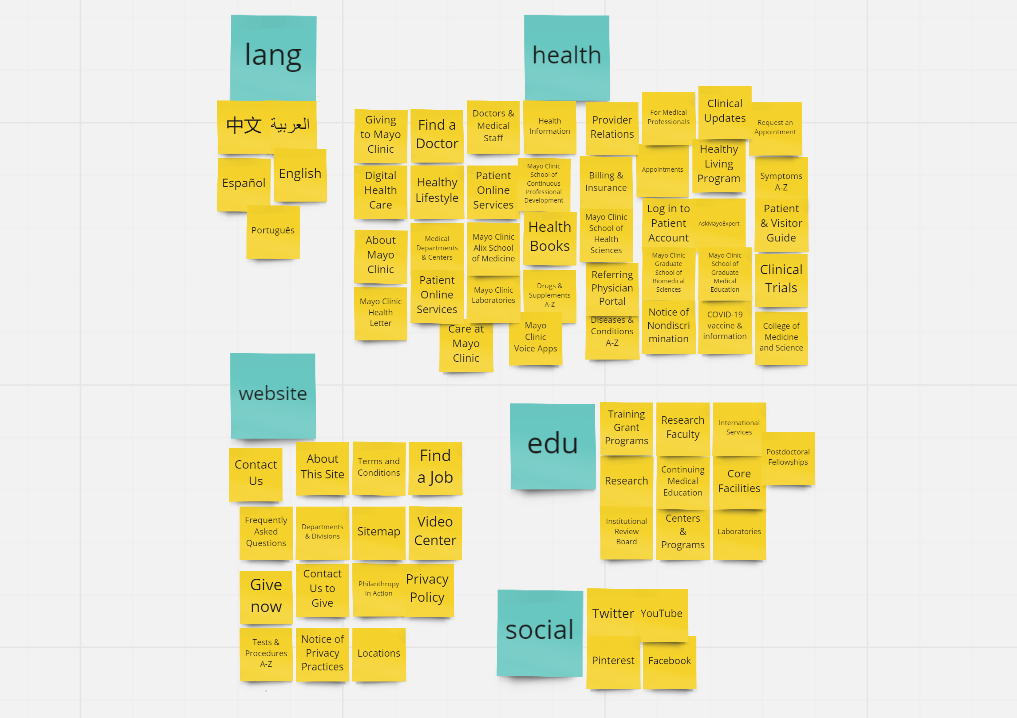
Understanding how people group information about health and healthcare
Lastly, after conducting card-sorting of the homepage with a user, I found that:
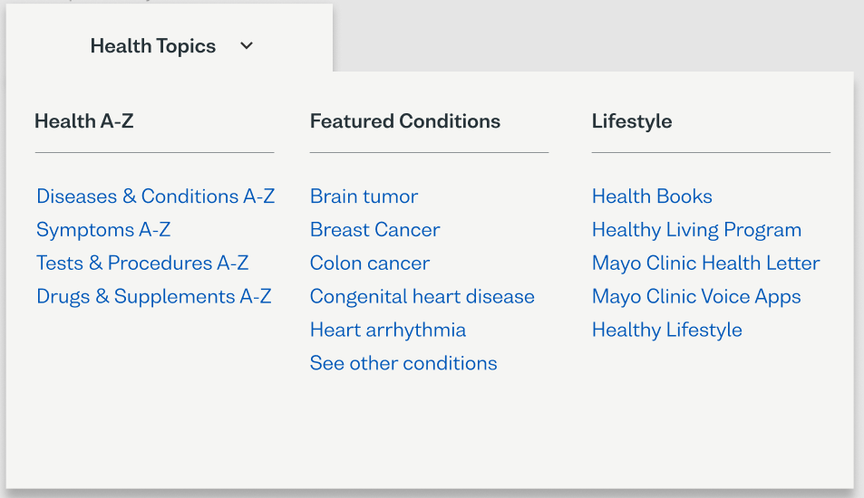
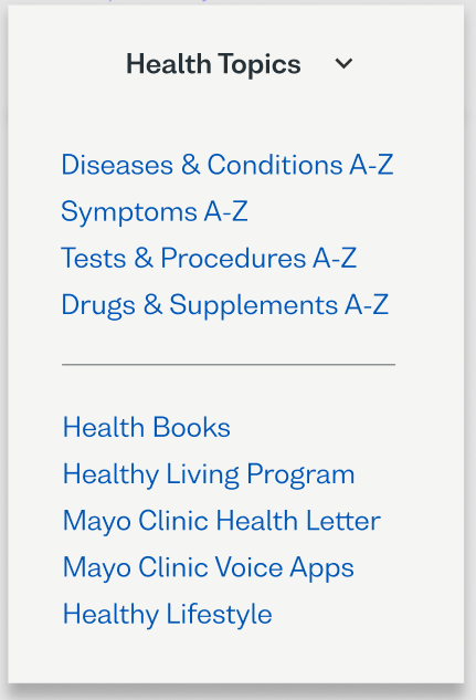
- ‘Health Information’ as a term is too broad for the top navigation bar. Anything on the website can be considered ‘health information.’ Therefore, the name of this item needs to be changed to something more specific.
- A broader term can be used instead of ‘College of Medicine and Science’. Some of their programs aren’t necessarily part of that college (e.g. the Mayo Clinic School of Continuous Professional Development). We can switch this label to ‘For Students.’
UX Storytelling
Designing for seniors, keeping in mind other users
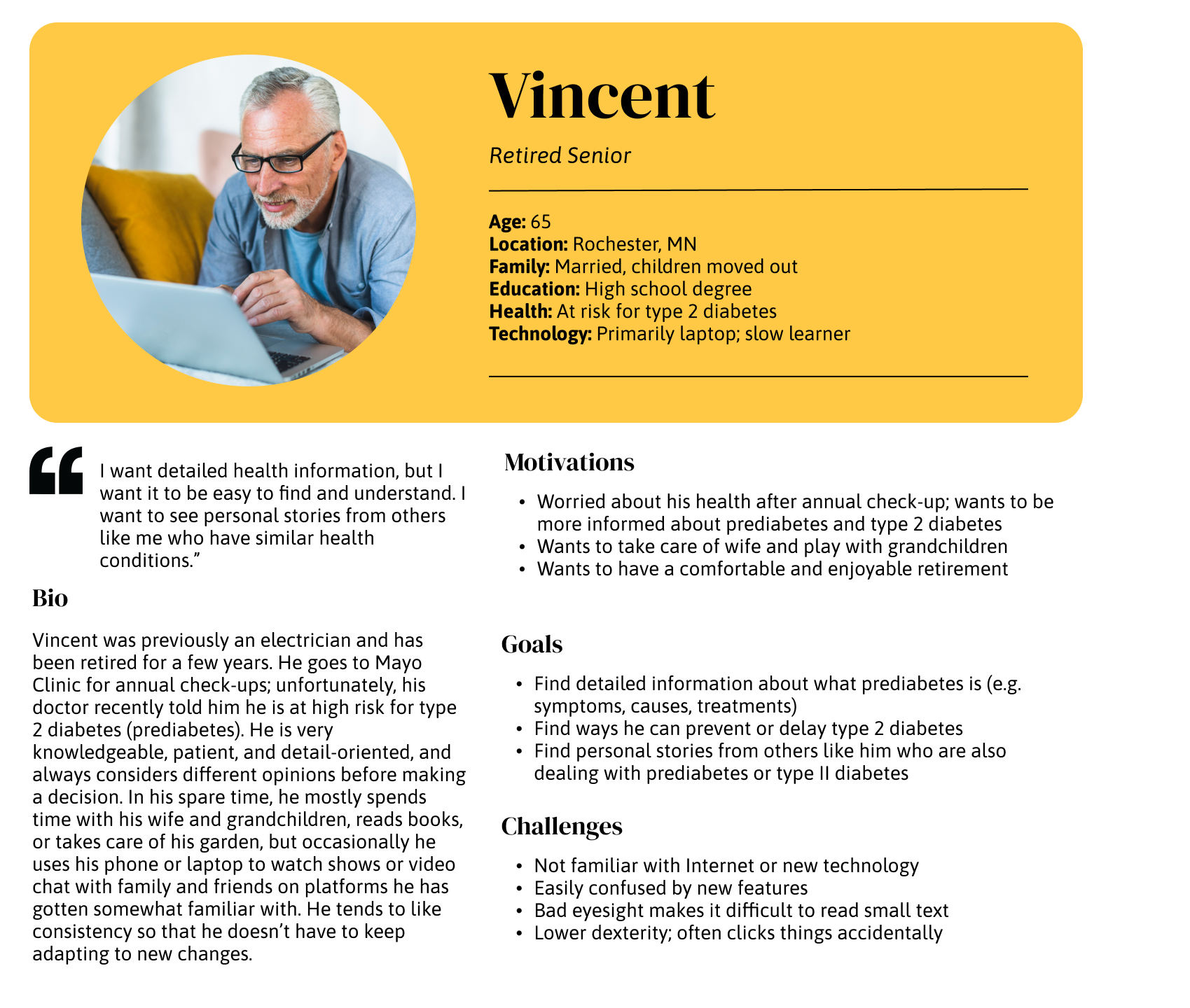
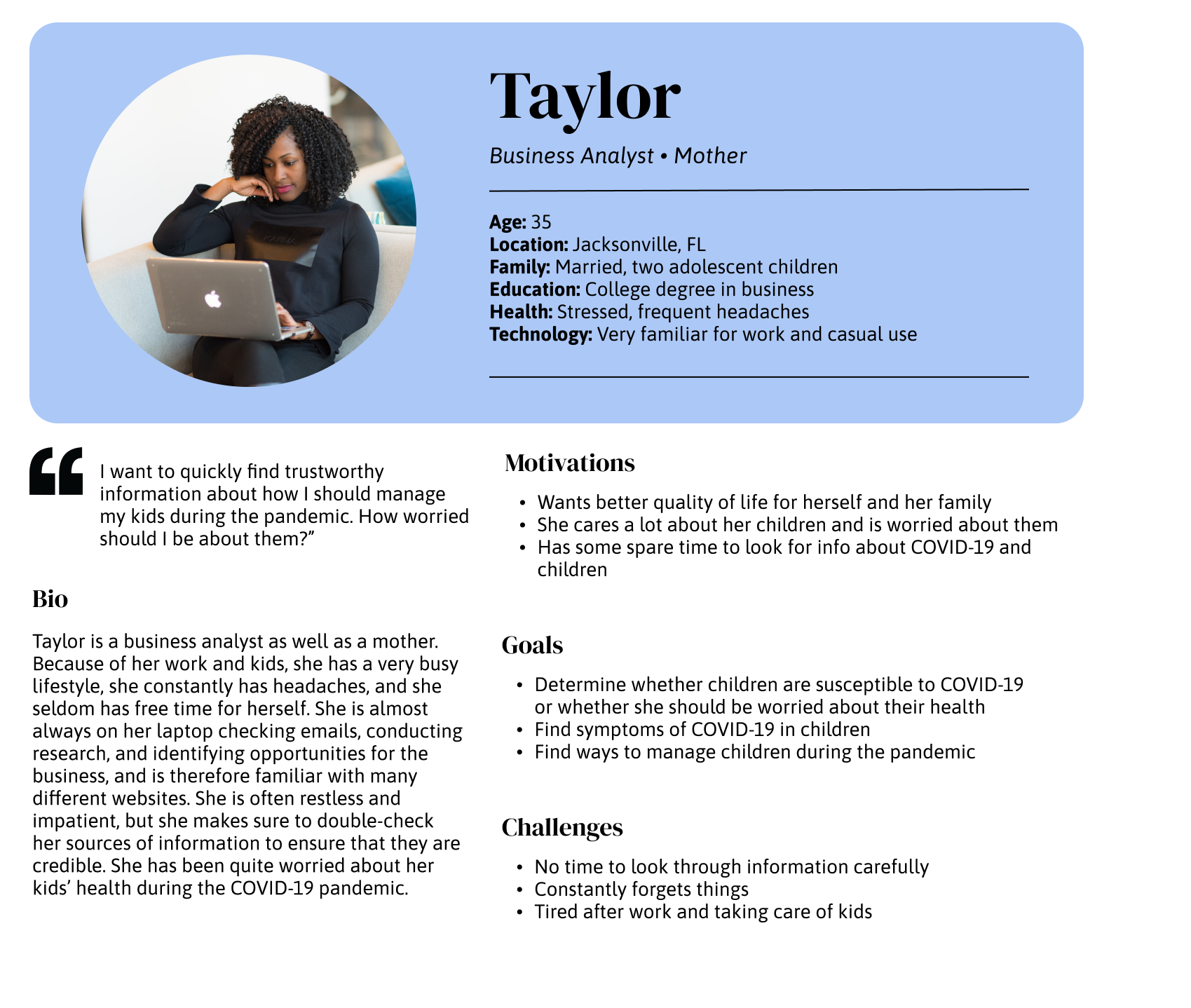
Based on the insights I gained from usability testing and contextual inquiry, I created personas of a senior, less tech-savvy user named Vincent and of a younger, more tech-savvy user named Taylor. I wanted to ensure that we keep in mind other types of users because health information is accessed by a wide variety of people of all ages.
Understanding the thought processes of those looking for health information
I also created empathy maps and user journeys to better empathize with how Vincent and Taylor may act when they are looking for health information. Specifically, I generated scenarios in which people would likely look for health information, again based on user interviews.
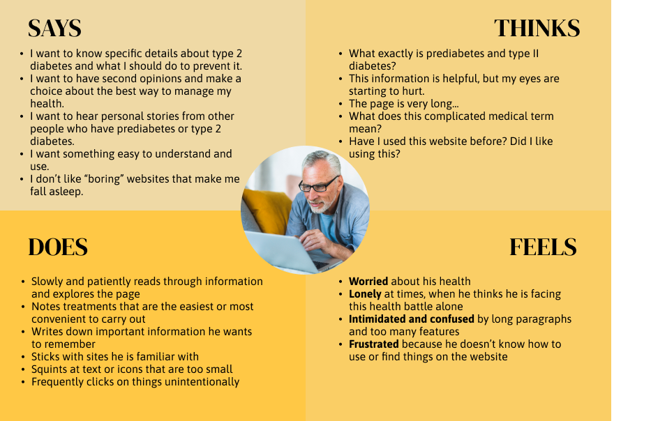
» Read more about creating these research artifacts
Wireframe and Graphic Design Element Variation
Finding ways to help users navigate through complex health information
In an attempt to satisfy the requirements of Vincent and Taylor, I ideated on a couple ideas that would address users’ pain points by:
- Reorganizing and/or implementing features to make it easier find health information
- Utilizing a consistent design system to showcase Mayo Clinic as a professional brand
- Using graphics and other features to produce a feeling of trustworthiness and personalization
- Directing them to a currently overlooked site (Mayo Clinic Connect) where they can communicate with other patients and caregivers
I then tested the prototype with a user to validate my design decisions and gain new insights.
Specifically, I found that:
-
The user ignored the right side of the page for the most part due to ad placement. They therefore had a hard time finding the Mayo Clinic Connect section. Features on the right need to have more visual contrast that separates the ad from the content of the page.
-
The user ignored the back-to-top button and opted to simply scroll instead. The user mentioned that they are used to scrolling and tend to ignore back-to-top buttons, even though they are noticeable. We should include bottom navigation visually similar to the top navigation, which could eliminate the need for a back-to-top button. Back-to-top buttons can be reserved for extremely long pages. Insights may be different for populations that are less used to scrolling or find it difficult to scroll through long pages.
-
The user did not utilize the ‘Health Information’ tab in the main navigation at all. They would rather just search. The user would rather search than use any other functionality, so the search function needs to be the most prominent and functional. The user may also have ignored it since the term ‘Health Information’ is too general, as we found before.
-
The user finds the clickable outline helpful to navigate quickly throughout the article, but was difficult to find. The user mentioned that they would normally just scroll and quickly scan the headlines of the article. However, they would find the clickable outline helpful when they scan too fast throughout the page and can’t find what they are looking for.
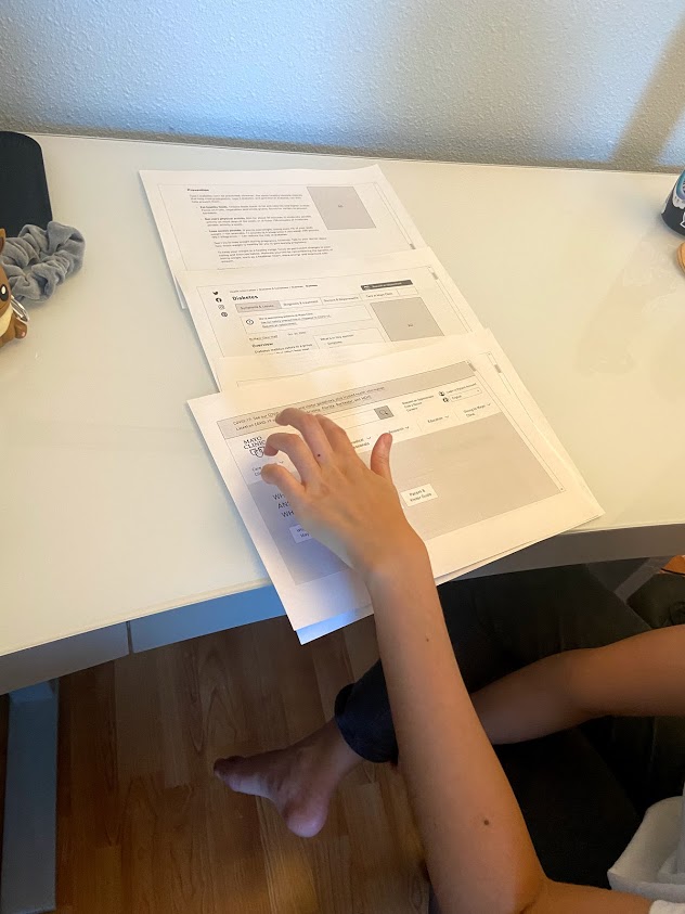
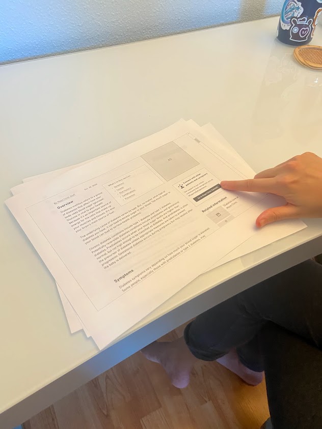
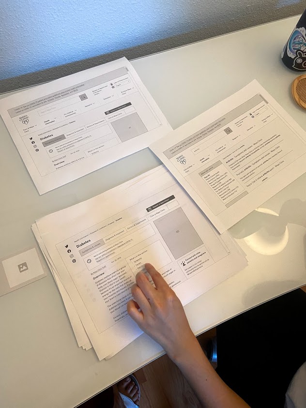
» Read more about building and testing my low-fidelity prototype
High-fidelity Prototype
A consistent experience that empowers seniors to find reliable health information
From all the insights I gained from research and user testing, I protoyped a website that would allow users of all types - not just seniors, but also people of all ages - to more efficiently find credible and detailed health information. Furthermore, the consistency of the design system makes it more clear that Mayo Clinic is a trustworthy and professional brand, and the use of more personal images and copy across the website makes the experience feel more personal. Altogether, this design could lead to higher user engagement, higher growth of new users, more efficient processes, and better brand perception of Mayo Clinic.
Link to interactive prototype here.
» Read more about creating the high-fidelity prototype
Evaluation and Revision History
Evaluating accessibility
Using the Stark plugin, I checked the accessibility for major areas of interaction and for all three color modes:
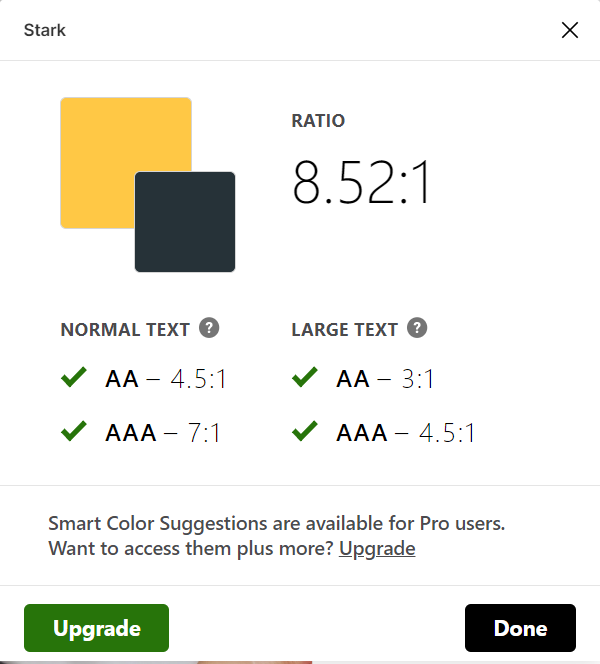
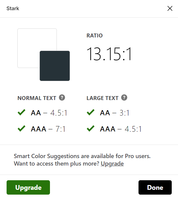
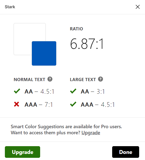
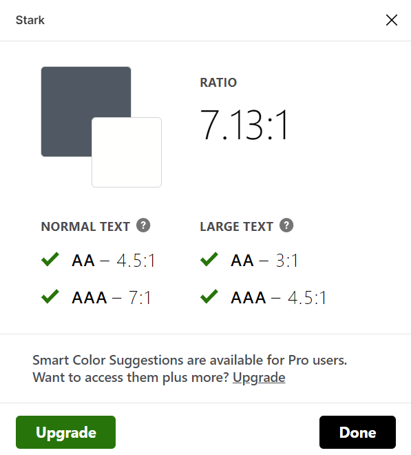
They all met the WCAG2.0 AAA level standard of accessibility except for the royal blue (taken from Mayo Clinic branding guidelines) and ‘white’ combination, which still met the AA level. I therefore concluded that these color schemes were accessible.
»Read more about the interface design
More Iterations
One user pointed out that the clickable outline in the high-fidelity prototype was difficult to find. In response to this, I removed the overview box and moved the outline up so that it is visible right under the secondary navigation bar. I also removed the box around the outline to make the interface less cluttered.
- Ideally, the clickable outline would be sticky so that it follows the user down the page. However, Figma currently doesn’t support sticky elements if they are outside the original size of the frame.
During a quick test of the high-fidelity prototype, the user commented that they thought it felt like a business website - serious and professional. I did want the website to have that impression, but I also wanted the site to look more and welcoming. I made sure to round off the corners of all the buttons to emphasize the more ‘friendly’ atmosphere.


They also commented that it was difficult to see the language toggle at first, which is especially important for accessibility. In response to this, I moved the language option more towards the left, added an icon, and changed the label to ‘English’ so that the user can see it more readily in the top navigation.


Lastly, Professor Sookie mentioned that having multiple columns within a drop-down can cause an operational accessibility issue, and it would be best to have only one column. Taking this into consideration, I opted for a linear menu that at least had a line to divide between different categories.
Pitch Video
Conclusion
Future directions
- Ideally, I would switch the landing page photo to one that captures a happier experience for the patient, but free stock photos on Unsplashs, Pexel, and other similar websites are limited in their selection of choices.
- In terms of ideation, next time I would make sure to first sketch out all my ideas, rather than think of ideas in my head and only use Whimsical to prototype what I think would make the most sense. By doing that, I would give myself more room to be more creative and innovative.
- I would tackle the Mayo Clinic app to make sure that the experience is consistent and easy to navigate across multiple platforms, especially since increasingly more people are using mobile apps out of convenience.
Overall self-reflection
Through my first-ever attempt at applying the full design thinking process, I most notably learned about:
- The importance of considering interface accessibility in color, layout, and typography. Especially since this was a project meant to advocate for senior usability, I had to make sure that the website took into account a multitude of potential accessibility issues, including appropriate color contrast, layout, typography, keyboard accessibility, etc. It’s a lot more technical than I expected it to be, but will be something I will always consider in the future.
- Acknowledging possible constraints. While doing this project, I considered how realistic it was for the company to actually implement this design. I wanted to implement some new features but also make sure that the design wasn’t completely different, not just because that would be difficult for developers, but also because users don’t tend to like change because they’re used to the original design. So, I would say this redesign is what I would imagine to be one of their near-future steps, especially since they’re already changing some of their newer pages to the new design system I tried to imitate.
- Checking our own assumptions. Many times throughout this process, I found the user did actions that I didn’t expect, and that helped me more deeply understand why we need to conduct user research before we start designing. We are constantly making assumptions, but we need to learn that we are not the user and that design decisions should rooted in data.
- Articulating design decisions. Throughout this process, I used insights from research and testing to validate my decisions, but it’s also important to describe why exactly these design decisions are important for the business itself, especially if the company doesn’t completely understand or value UX design. Therefore, I showed how this design could lead to higher user engagement, higher growth of new users, more efficient processes, and better brand perception of Mayo Clinic, which ultimately benefits Mayo Clinic as a business.